

Business Intelligence and Dashboard OpMon to view indicators of your business
Many professionals have come to us with the objective to monitor and show business indicators, from our OpMon Dashboards solution. Most of them are used to Business Intelligence (BI) tools, which aim to analyze business data, these professionals face difficulties in understanding the concept developed by us, once OpMon Dashboards work differently, since it originates in a solution of IT infrastructure monitoring. That is, there are similarities between the two types of solutions, but it is like comparing things that work from a different logic. Nevertheless, the result can often be similar.

IT management with OpMon is accomplished via proactive checks that allow you to monitor availability and key indicators of any kind of physical or virtual equipment (routers, servers, industrial machines, among others) as well as business-critical systems, such as ERP systems, database, CRM, issuance of NFe. Data are collected by default via preconfigured agents (SNMP, WMI, SQL, SOAP Protocol, etc.) or custom agents. The latter varying according to the customer’s environment and goals, being an exclusively advisory work. Any type of device, equipment or system can be monitored from managing any type of data.
From this, we can see that the collection of information works differently. BI performs data import through the consolidation of information from a database, such as TXT, XLS, SQL database, etc. This means that it is focused on historical monitoring, without saving data.
Whereas OpMon, by performing proactive monitoring (every 1 minute or even every 5s), allows real-time monitoring of all data, applications and systems infrastructure of organizations. In addition, it keeps all data at its base, which allows the presentation of complex reports as baseline, for example.

BI tools on the market, such as QlikView, have a robust library for graphics, usually positioned via drag&drop inside a Canvas visualization system. This allows many viewing possibilities, but makes the process somewhat complex and with a considerable learning curve. Importing of more complex data requires a business analyst who identifies the ways data are being captures from the customers’ requirements. In QlikView, or in most part of the most robust BI solutions, these data can also be imported through a code for complex data collection by rules or plugins and agents.
One of the differences of OpMon Dashboards is the ability to generate alarms from thresholds. In addition to creating rules with criticality colors (ok, warning, critical), it allows you to set alert cuts when indicators are below the Service Level Agreement (SLA). These notifications can be received via platform, email, SMS, sound alerts, among other ways that can be customized.
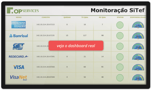
OpMon Dashboards: VAT monitoring
Among the greatest advantages of OpMon Dashboards on Business Intelligence tools is the possibility of historical monitoring throughout the day (without the need to consolidate data), the creation of future forecast charts (via HoltWinters algorithm, the same used in weather forecast) and the definition of rules for cuts that are monitoring platforms and capabilities that do not exist in Qlikview , for example, which is a complex data viewer.
Anyway, BI solutions are very good when the business or TI areas of the organizations know what they want and, mostly, when they can take actions based on the information collected. However this is the scenario that is less usual. Most of the times we have to stimulate that kind of maturity in our new customers. OpMon Dashboards is an effective communication channel to connect the IT and infrastructure areas with the business area, giving the visualization of what happens in your organization for all areas of the company. The result is the possibility of anticipating the problems and a more agile decision-making process.

OpMon Dashboards: Financial Dashboards
Models of dashboards, segmented by vertical market
To learn more about the platform for building Opmon dashboards, click here to view some examples of dashboards developed by us and by some of our customers to speed up the decision-making process.
Related topics
After all, what is a dashboard good for?
Dashboards: the communication protocol between the CEO and the CIO
Understand the importance of dashboards for tech companies


